
August 2020
Unity Health & Performance
Brand Identity
.svg)
Scroll to see full case study
Overview
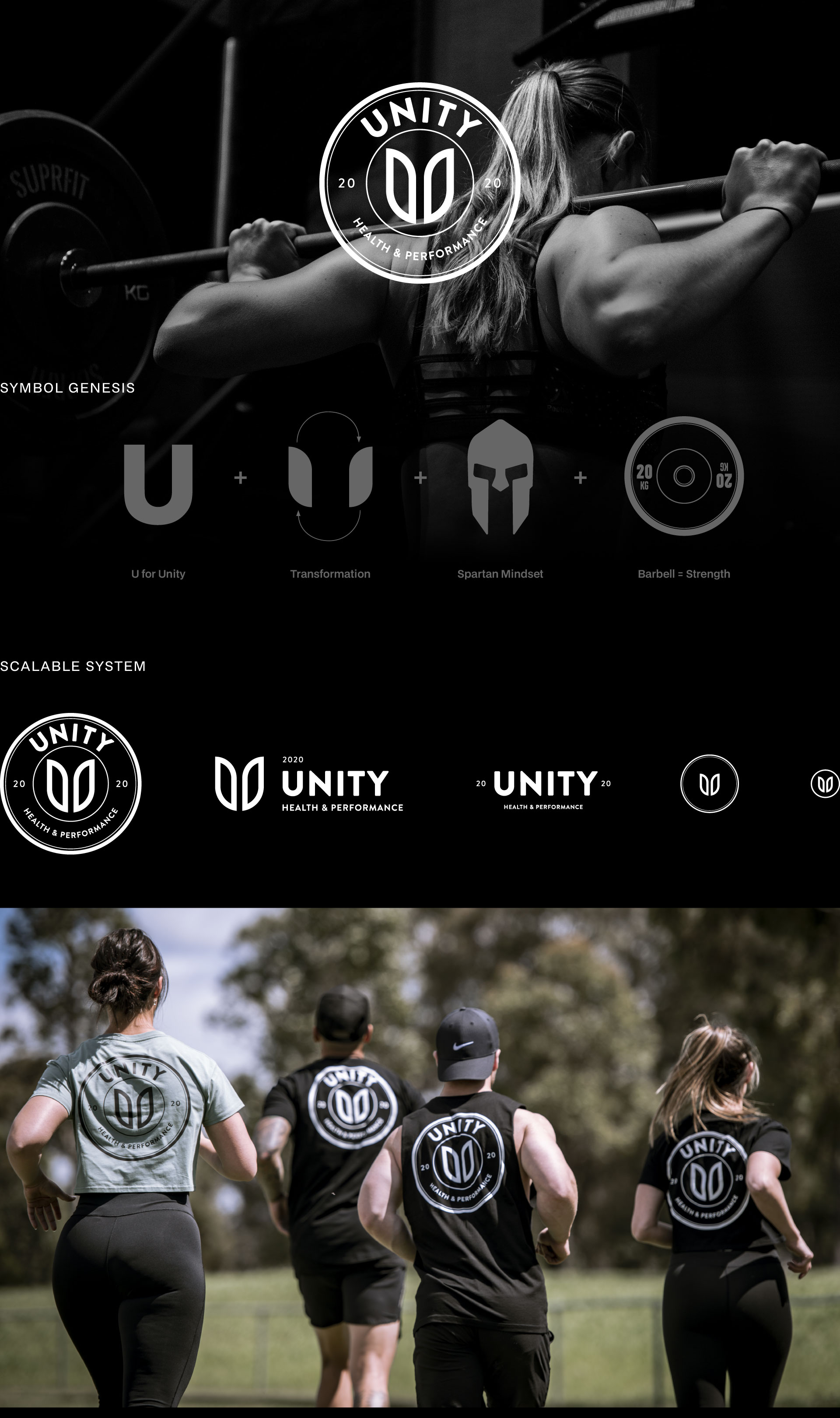
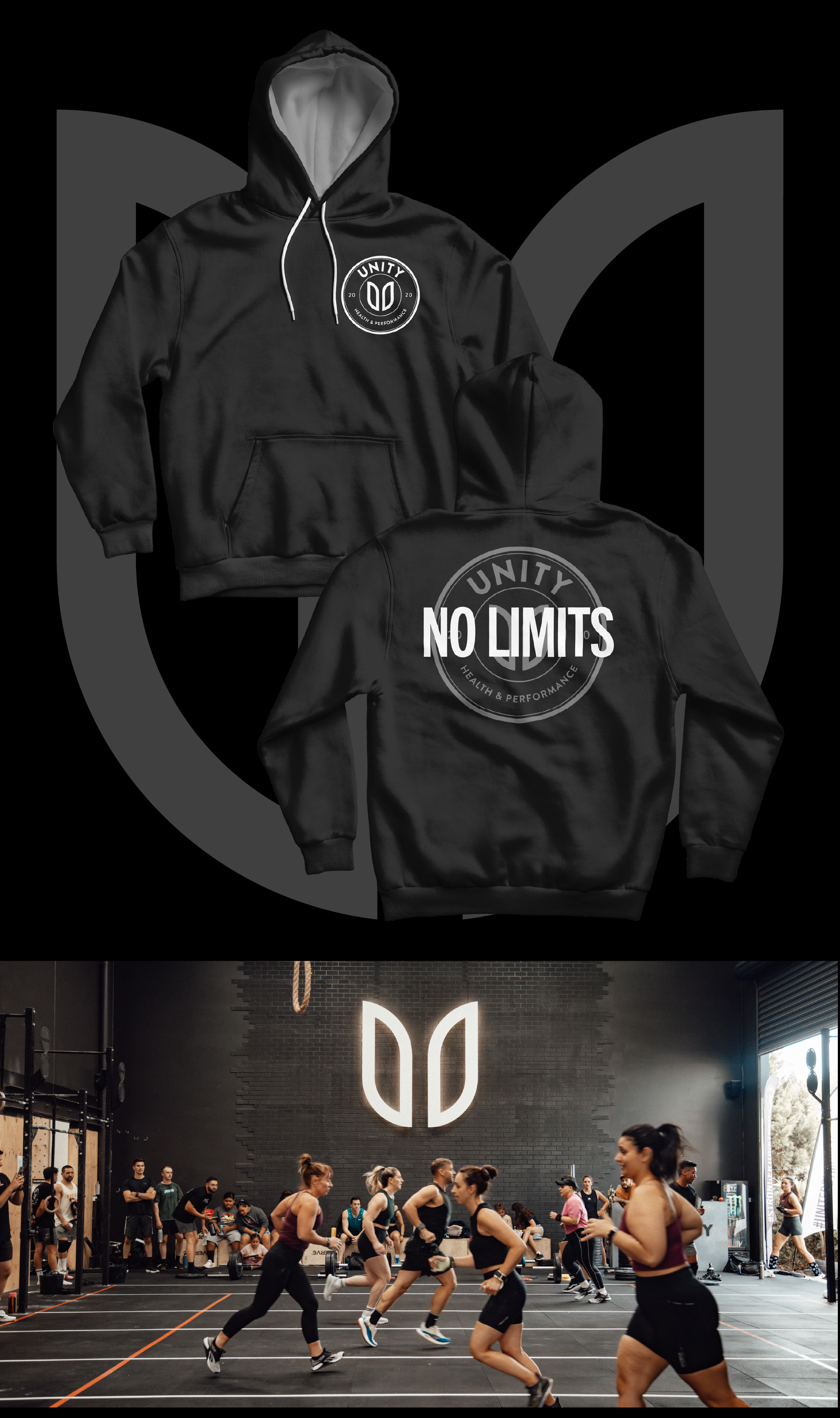
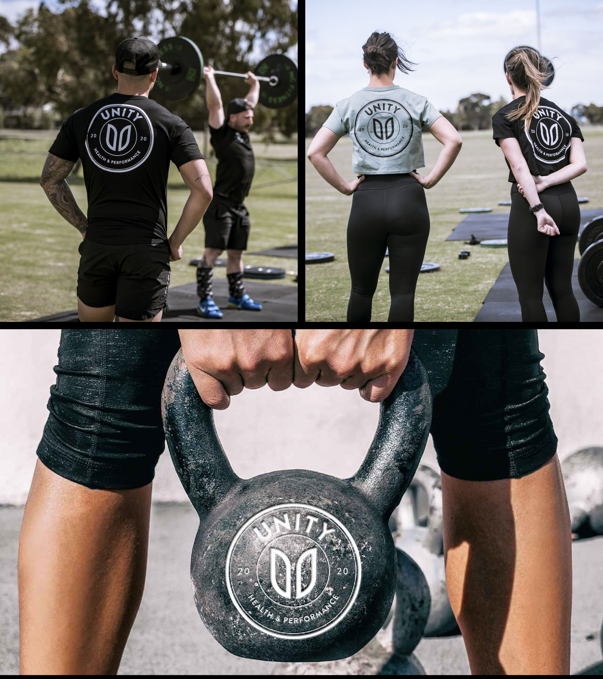
Unity Health & Performance is a Melbourne-based strength and conditioning facility founded by Phouc and Daniel after 15 years in the fitness industry. Launching into an already crowded market during strict COVID-19 restrictions, they needed a brand that could attract and unite a community without relying on in-person gym experiences. The identity was developed remotely from New Zealand during lockdown and positions Unity as a place where people build both physical strength and deeper self-belief.
No items found.
Visual Direction
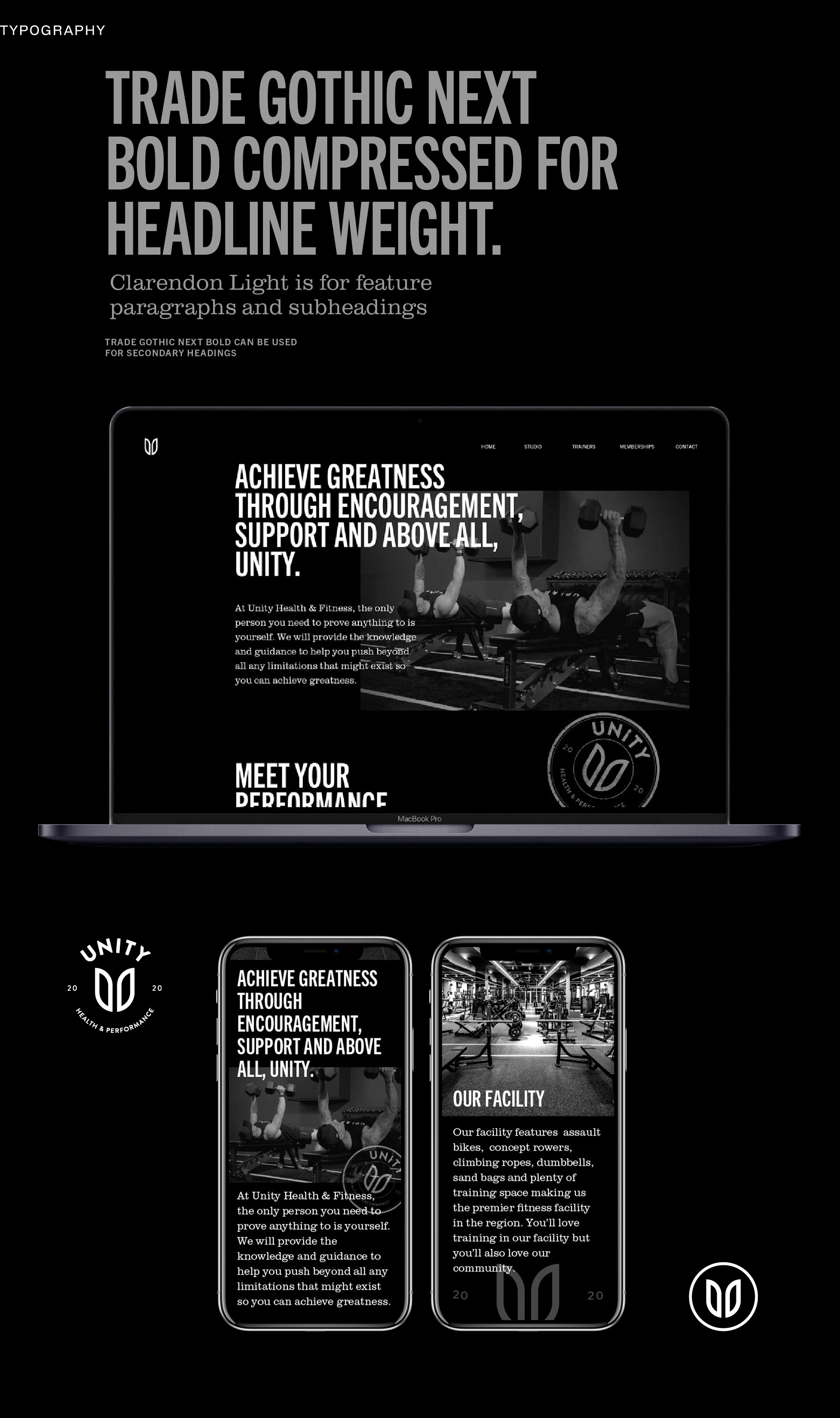
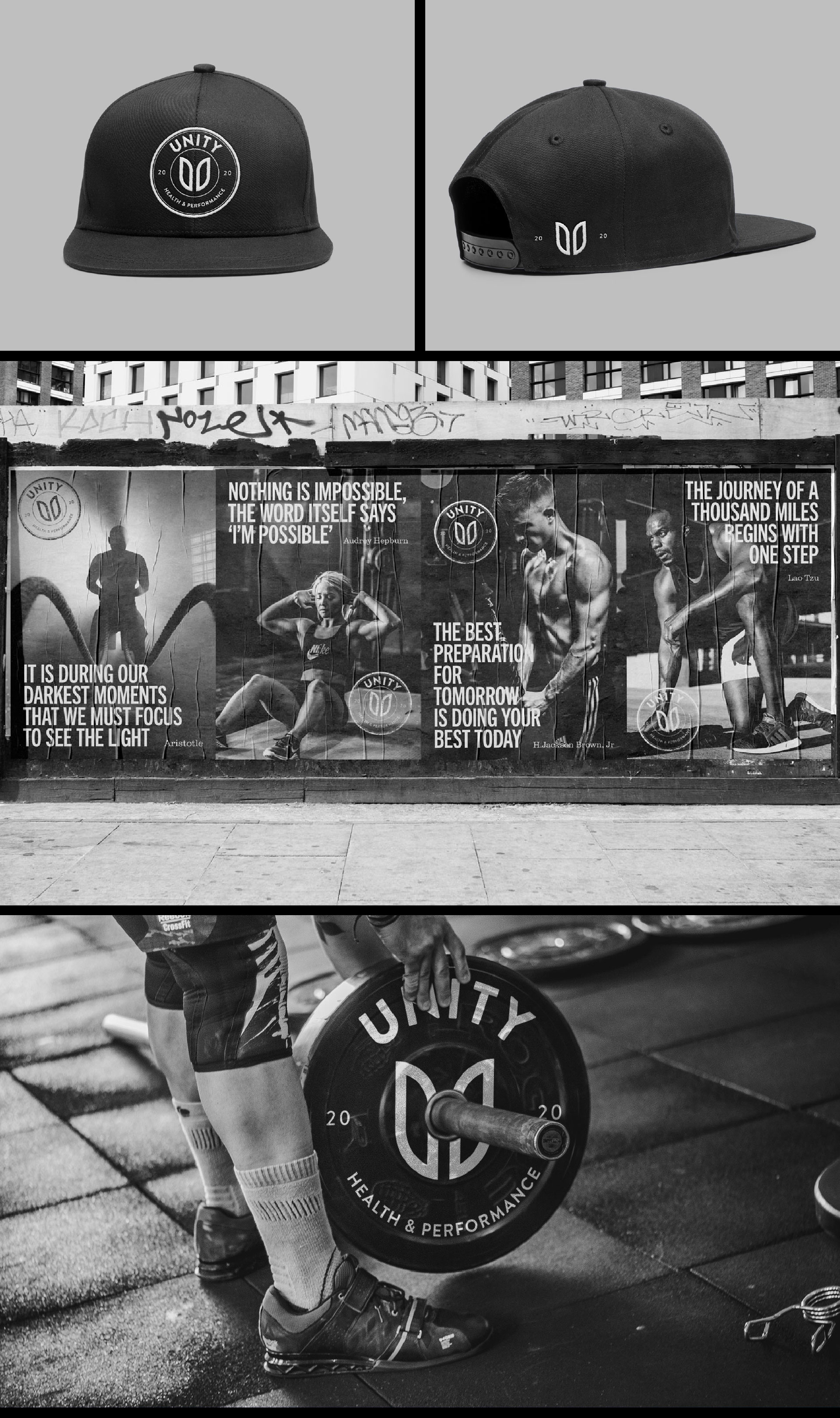
Design a brand identity that feels strong, understated, and community-focused, positioning Unity as the place to pursue internal and external greatness. A dark, neutral palette (black, charcoal, grey) keeps the brand low-key and inclusive, avoiding the “showy” gym aesthetic, with white and natural wood tones used sparingly for contrast and warmth. The visual style is clean, tidy, and confident without appearing flashy, with a clear hierarchy that emphasises UNITY as the primary brand idea and Health & Performance as a supporting line.
Design Outcome

No items found.
Explore
projects
projects
