
Loop Media
.svg)
Loop Media needed a refreshed identity and website that would better reflect its production expertise and create a stronger, more modern presence across digital and screen-based touchpoints.

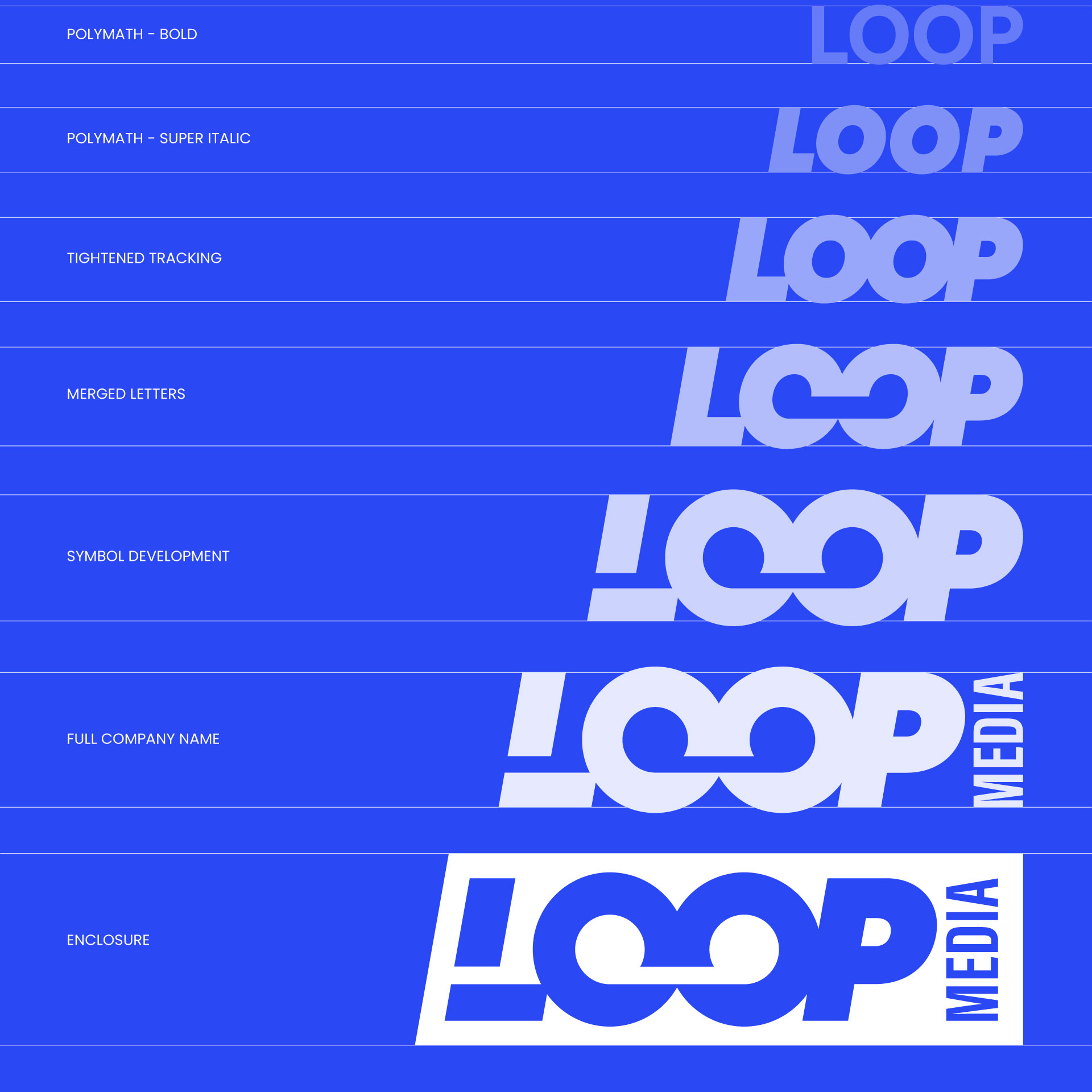
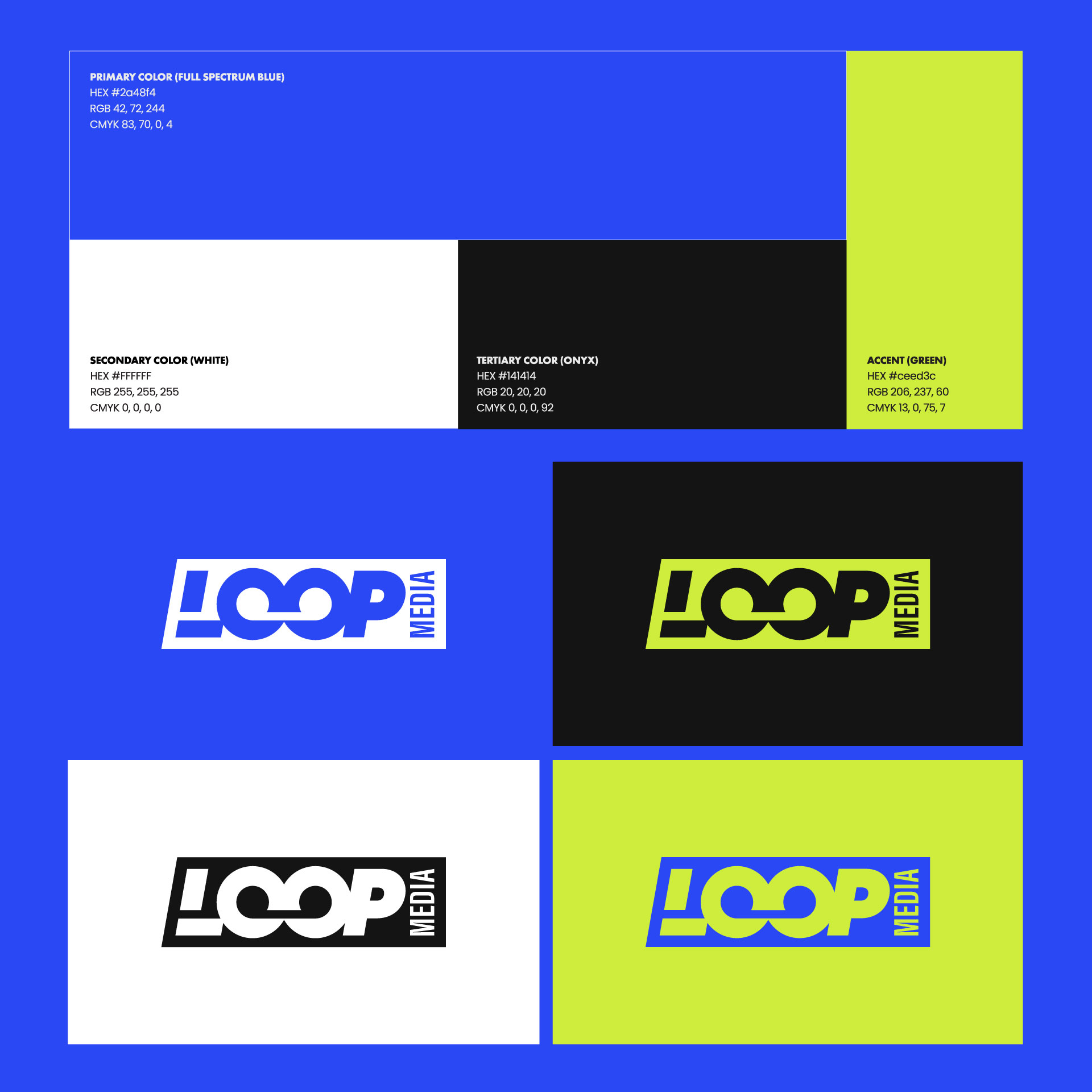
I developed a visual system built around the logic of a broadcast control room: structured, modular, and precise. The new logomark draws on references to vintage film cameras, tape formats, and digital display screens, giving the brand a sense of motion and technical heritage without feeling nostalgic or dated. A clear typographic hierarchy and a restrained palette of Onyx, Full Spectrum Blue, Lemon Lime, and white help the identity feel modern, functional, and easy to apply across digital and promotional touchpoints.
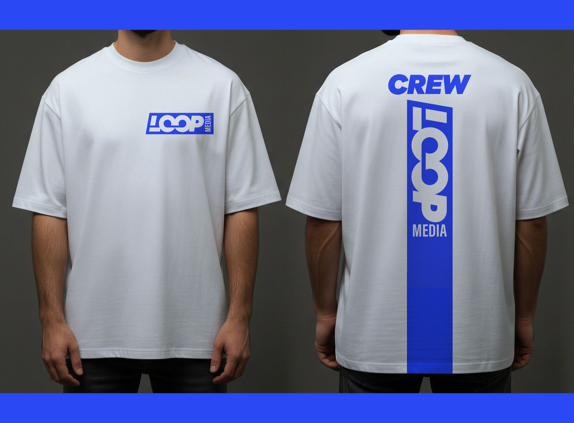
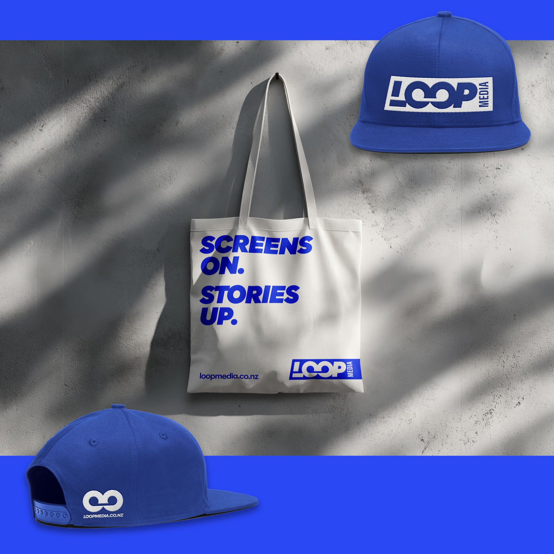
The result is a more confident and cohesive brand that positions Loop Media as a specialist studio with both technical credibility and contemporary polish. The new identity creates a stronger foundation for the website and gives the business a more distinct presence across its client-facing communications.
Design Outcome


projects
